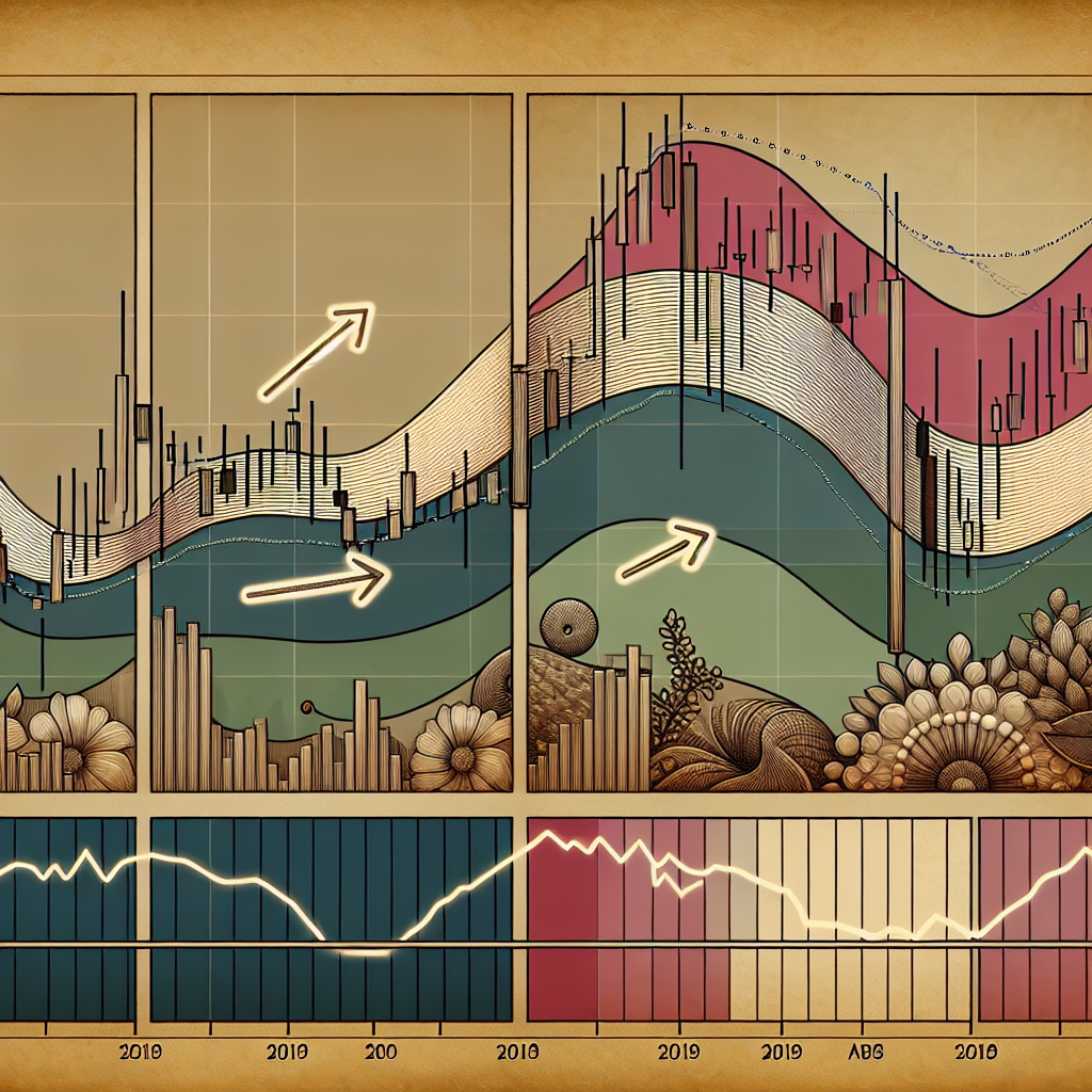
Introduction to MACD Histogram
The Moving Average Convergence Divergence (MACD) histogram is a popular tool used by traders to identify potential buy and sell signals in the market. It is a type of oscillator that shows the difference between two moving averages, which are typically a 12-day and 26-day exponential moving average (EMA). The MACD histogram provides a visual representation of the difference between these two EMAs.
Understanding the MACD Histogram
The MACD histogram is plotted around a zero line, also known as the baseline. When the histogram is above the zero line, it indicates that the 12-day EMA is greater than the 26-day EMA, suggesting an upward market trend. Conversely, when the histogram is below the zero line, it suggests a downward market trend.
Positive and Negative Values
Positive values on the MACD histogram indicate bullish momentum, while negative values suggest bearish momentum. The further away the histogram is from the zero line, the stronger the market momentum.
Signal Line
The MACD histogram also includes a signal line, typically a 9-day EMA of the MACD line. When the MACD line crosses above the signal line, it generates a bullish signal. Conversely, when the MACD line crosses below the signal line, it generates a bearish signal.
Interpreting the MACD Histogram
Traders use the MACD histogram to identify potential market reversals and to confirm the strength of a trend.
Identifying Market Reversals
One way to use the MACD histogram is to look for divergences between the histogram and the price action. A bullish divergence occurs when the price is making lower lows, but the MACD histogram is making higher lows. This suggests that the downward trend may be weakening and a potential reversal could be imminent. Conversely, a bearish divergence occurs when the price is making higher highs, but the MACD histogram is making lower highs, indicating a potential reversal from an upward trend to a downward trend.
Confirming Trend Strength
Another way to use the MACD histogram is to confirm the strength of a trend. When the histogram is increasing in height, it indicates that the trend is gaining strength. Conversely, when the histogram is decreasing in height, it suggests that the trend is losing strength.
Conclusion
The MACD histogram is a versatile tool that can help traders identify potential buy and sell signals in the market. By understanding how to interpret the MACD histogram, traders can gain valuable insights into market trends and momentum, helping them make more informed trading decisions. However, like all trading tools, the MACD histogram should be used in conjunction with other indicators and analysis methods to increase its accuracy and effectiveness.


